MENU
Your website’s design is crucial to your online marketing presence and digital marketing strategy. A well-made website conveys professionalism. By presenting clear, consistent and easy-to-find information, your website can help you earn repeat business and foster customer loyalty.
We’ll explore best practices and tools for optimizing your website design process, explain why excellent website design is crucial, and check out examples from impeccably designed business websites.
Whether you want to improve your website’s design or you’re just starting to build your website, these eight tips will help you design an appealing, functional website that keeps customers and prospects engaged.
When creating or redesigning a website, your first step should be to develop a detailed plan of what you want to do, how to do it, and how each website element will help serve your customers.
To get started, you’ll need to pinpoint your target audience and map out a customer journey from start to finish. Customer data informs each design step and determines what your website should offer. For this step, you should gather solid data on the following:
Classify your prospects to build customer personas with distinct demographics, pain points, unmet needs and channels they turn to for information.
Modern website design is clear, crisp and efficient, so rid your website of anything clunky and unnecessary. Consider removing the following features:
Today’s busy customers have short attention spans and don’t want to wade through pages of fluff content to find what they need. Meet customer needs with a straightforward website design that helps them quickly solve their problems.
Your online presence should be a cohesive unit, with your website as the hub. Consider including buttons on your website that link to your social platforms, including Facebook, Twitter, LinkedIn and Instagram. Ideally, place them in a footer that travels with the customer as they click from page to page.
Include social proof like positive customer reviews, testimonials, awards and endorsements on your home page, product pages and checkout page.
More people than ever are visiting websites via tablets and mobile devices, so a scrollable homepage means your website is accessible to more users.
Additionally, a scrollable homepage is modern and engaging because you can animate website elements to pop up or move as the user scrolls to them. This design adds an element of interest without being overpowering or distracting.
Organize your scrollable homepage into sections to make it easy to navigate. It should include the following sections:
White space is no longer something to avoid. Use white space (or blank space of any color) thoughtfully to help break up pages and make your content easier to read by prioritizing essential text. White space can also help you determine where to place other page elements.
According to Statista, mobile comprises nearly half of all worldwide web traffic. Additionally, Google data says 50% of mobile users will choose to visit a business’s mobile site over downloading an app, and 59% prioritize the ability to shop via smartphone when choosing a brand to purchase from.
It’s clear that businesses must make their websites mobile-friendly. Ensure your website is mobile-responsive and looks just as good on smaller screens as it does on desktops. Tailor your mobile sites to respond directly to visitors’ needs. Consider why they’re accessing your mobile site and what they’re likely looking for, and make it as easy as possible for them to get that information.
SEO is vital for any business’s online presence and should be considered at every step of creating or redesigning your website. Consider what content is relevant and interesting to your customers, and build your SEO strategy to cater to that content.
Technical SEO tips that can improve page rankings include using a reliable web host, speeding up page load times, and eliminating crawl errors on your site.
Customers are highly concerned about and protective of their personal information. Do everything you can to give them the peace of mind of knowing their data is safe on your site.
Website security measures include having a current SSL certificate. This small data file binds a cryptographic key to your business and secures credit card transactions, data transfers, logins and browsing. A current SSL certificate is essential because it creates the HTTPS application protocol and the padlock symbol in a user’s search bar. If your website doesn’t have an HTTPS application protocol, Google will often flag your website as not secure and direct the customer away.
A good business website incorporates various elements that make the user experience seamless. Some crucial elements to prioritize in your website design include:
Most users come to your website with a goal, such as finding an item’s price or contacting customer support. You want to make it as quick and easy as possible for them to complete that goal. A confusing website where users must click around and search extensively creates frustrated customers likely to leave your site for a competitor’s.
Your navigation should be clear and self-explanatory and include broad headings with related subtopics. If you have many pages, consider using breadcrumb navigation along with menu navigation so users can easily backtrack to a higher level.
Responsive web design focuses on making websites look good and function well on any device. More users are accessing web pages via smartphones and tablets, so a responsive website that works well on various devices is crucial.
A mobile-optimized website creates a positive viewing experience by resizing pages, adjusting menu formats and incorporating dropdown tabs.
Search engines also consider mobile website layouts when crawling sites, so if you want to appear higher in search engine results, ensure your website is mobile-friendly.
To transform your static site into a responsive website, choose a framework that allows you to modify and upgrade your existing site’s code; you’ll then convert the code and review your site.
Whether you’re creating a new brand image or reinforcing an existing one, consistency creates a sense of cohesion and professionalism. Your website should have the same layout, typography and color scheme on every page. This way, users know where they are and where the information they need is located on each page.
A designated style guide will also make the process of adding pages or elements to your website quick and easy because you have a set template of how those pages should look on the website.
It can be easy to go overboard adding images and videos to web pages; after all, images and videos see more engagement than text alone. However, you should avoid overwhelming your pages with too many unnecessary images. Try to achieve a balance of text and appealing images that fulfill a purpose; don’t include an image just for the sake of doing so.
Place images after text blocks to support the information. If you’re exploring video content marketing, place explainer videos, how-to videos and video testimonials where they can shed light on specific information.
Your images and videos should reiterate your points and engage customers without overwhelming them.
Your website copy is crucial because it conveys necessary information to customers. Ensure your copy is well-written and error-free, and that it shares your message in an engaging manner. Your style guide should include guidelines on how to ensure your copy is consistent across your website and all branding materials.
Your copy should speak to visitors in terms they’ll understand; avoid being too technical or using too much jargon. Foster a unique brand voice that stays consistent across all your marketing channels and materials. Ideally, customers should be able to know immediately that any piece of content is from your company.
A call to action (CTA) directs customers to complete a specific action. For example, you may want them to subscribe to your blog or newsletter as a way to generate more sales leads.
Your CTA buttons should be clear and eye-catching and conform to your branding. Sprinkle CTAs throughout your site to continually prompt visitors to take the desired action.
Page load speed is how quickly your website pages load when a customer clicks them. Page load speed affects customer behavior directly: If a page takes too long to load, the customer will grow impatient and seek the information on another, faster website.
Page load speed also affects how Google ranks your website. You can use Google’s PageSpeed Insights tool to see how quickly your site loads and identify where you can improve your page speed.
Fast page load speeds keep customers on your site longer. Other ways to keep customers on your site and boost sales include using pop-up opt-ins to gather information and offering live chat support options.
Website design is a critical aspect of successful business marketing. It’s often where you make your first impression on customers and typically where they’ll go to learn about your business.
“A website works best when it serves both the business and the visitor,” said Adriane Galea, founder of The Marketing Alchemist. “For the business, it should have clear calls to action and help convert traffic into customers, leads, clients and so on. For the visitor, it should provide an easy solution to their problem or query.”
Here are six reasons why website design is crucial:
Common website design mistakes include launching an incomplete site, using poor-quality photos, and not checking that all links work.
We consulted with experts to pinpoint business websites with excellent designs. Check out these business website designs to help inspire your strategy:
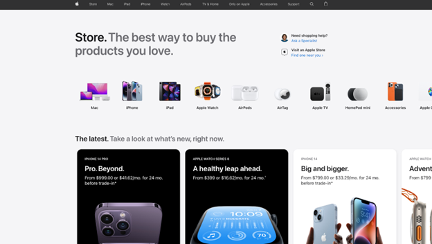
Apple has mastered clean, clear minimalist design, and the company’s products and website embody that aesthetic.
“I love Apple’s web design and how they get right to the point with a seamless experience for the end user,” said Teo Vanyo, CEO of StealthAgents. The website is visually engaging and easy to navigate, and it carries a cohesive style throughout every page. Plenty of blank space makes the visuals and copy pop and draws your eye to what’s important on each page.
Source: Apple
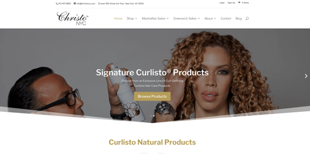
Christo NYC is a New York City-based hair salon with a modern, sleek website that showcases the business and makes it easy to book appointments and learn about services. Christo NYC incorporates appealing images without overwhelming the page and has a clear brand style.
“I like Christo’s website because it immediately leads people to booking, has a good flow of information, establishes credibility with great website copy, and uses a simple and easy design,” Galea said.
Source: Curlisto
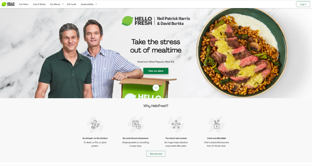
HelloFresh is a popular meal kit delivery business. The company’s website uses bright colors, punchy copy and a scrollable design. The homepage is engaging, with clear sections and multiple calls to action.
“If you visit their website, you will notice that everything is available from the homepage,” said Ryan Scribner, co-owner of personal finance blog Investing Simple. “You can learn about the product, sign up for a subscription plan, and even read the FAQ right from the homepage. Most people who visit the site will have their questions answered right on the homepage, meaning they don’t have to go digging for information. From a design standpoint, this site is great, too. You find consistent branding, colors and fonts site-wide.”
Source: HelloFresh
Gotham Greens is a greens grower and distributor based in New York City. The company’s website uses a modern, minimalist aesthetic with a scrollable homepage. The website’s copy is minimal and direct, making it easy for customers to learn what the business does and find what they need.
“It’s simple but effective, utilizing a one-page design to present the most relevant information without the user having to do more than scroll,” said Jake Hill, CEO of DebtHammer.
Source: Gotham Greens
If you’re considering outside help, ask your web developer some essential questions. For example, have they worked on projects like yours? What services do they provide? What do they charge?
The best website builders and design services can help you create the perfect website. We’ll highlight a few that business owners and marketers recommend.
Wix offers free, customizable website templates for creating your website pages.
“There are many free resources out there that offer templates that are completely customizable, but one of my favorites is Wix,” said Kelly Andersen, marketing director at Wealth Continuum Group. “They have beautiful designs, and it is simple to create a completely customized website that is also optimized for mobile, and that will also be able to be found on Google and other search engines.”
Learn more about how Wix can solve your web design needs.
Figma and Sketch are two web-based vector graphics editors and prototyping tools that allow users to design, prototype and collect customer feedback. They both offer collaboration features like real-time feedback and easy file sharing, allowing team members to work together seamlessly.
“We recommend Figma and Sketch,” said Paula Glynn, director of search marketing and digital strategy at Pixelstorm. “These tools integrate really well into the web development process, and using these [tools] results in pixel-perfect websites. They are both run by innovative companies who keep the tools and improvements updated regularly.”
Canva is a graphic design platform you can use to create multiple types of visual content, including website graphics. Canva is free, but paid subscriptions offer increased functionality.
“Canva is, hands down, the best resource for easily creating professional-looking graphics, logos, and more, and can also be a huge help in creating content for social media,” Galea said.
Elementor is a software company that allows users of the website builder WordPress to create and edit their websites using a drag-and-drop builder tool. The software features a built-in responsive mode and can help you speed up your website, drive traffic, and create professional-looking web pages.
“I love Elementor. It’s a drag-and-drop website design tool, and you don’t need to have any website design experience to use it,” said Julian Goldie, who runs an SEO link-building business. “What would normally take you hours to code (or a lot of money in website design staff) can easily be achieved in minutes with Elementor.”
Hotjar is a behavior analytics tool that analyzes website use and provides feedback in the form of heat maps, session recordings and surveys to help you determine which parts of your website are performing well and which require attention.
“A heat map, like Hotjar or Crazy Egg, allows a webmaster to install a snippet of code on their site,” said Ben McLaughlan, founder and owner of Easy Mode Media. “The app then records valuable information about audience interaction with the website. If there is a section of the page that people click away from or a button that never gets clicked, this is important information when optimizing a website and landing page for conversions.”
Kiely Kuligowski contributed to the reporting and writing in this article. Some source interviews were conducted for a previous version of this article.
B. newsletter is your digest of bite-sized news, thought & brand leadership, and entertainment. All in one email.
Our mission is to help you take your team, your business and your career to the next level. Whether you're here for product recommendations, research or career advice, we're happy you're here!

