Porto. Notícia Miguel Nogueira Reabriu, esta manhã, o tráfego no tabuleiro inferior da Ponte Luis I, que liga o Porto a Vila Nova de Gaia, no seguimento daconclusão da empreitada "Ponte Luis I sobre o Rio Douro – Reparação do Tabuleiro Inferior", da responsabilidade da Infraestruturas de Portugal (IP). Para além dos peões, o tabuleiro é, a partir de agora, apenas utilizado por transporte público e velocípedes. É ainda permitida a circulação a táxis e a veículos de emergência médica, estando a passagem interdita a transportes turísticos, hop-on hop-off e TVDE. Esta intervenção teve como objetivo a reabilitação e reforço do referido tabuleiro, tendo-se reparado um conjunto de anomalias identificadas e outras que foram sendo conhecidas, no âmbito dos trabalhos de decapagem geral da pintura e corrosão existentes. Para além da reparação das anomalias referidas, a maioria das quais relacionada com corrosão superficial de elementos metálicos, foi necessária proceder à substituição pontual de rebites, retificação de chapas deformadas, manutenção dos aparelhos de apoio, substituição das juntas de dilatação, reparação das portas de acesso aos encontros e reabilitação dos serviços afetados. Pretendeu-se também conferir à ponte, e em particular ao tabuleiro inferior, uma capacidade resistente compatível com as sobrecargas rodoviárias atuais, pelo que a construção de um novo tabuleiro, permite eliminar a limitação de circulação de veículos com peso bruto superior a 30 toneladas, passando a ser admissível a circulação de veículos com peso bruto inferior a 60 toneladas, situação que implicou o reforço estrutural do banzo superior e das diagonais que compõem as longarinas, assim como o aumento da rigidez do tabuleiro, com a construção de uma laje em betão armado, em substituição da laje existente. A intervenção no tabuleiro inferior teve ainda em vista a redução das vibrações induzidas pela passagem de grandes grupos de peões durante eventos festivos ou desportivos, controlando-se as vibrações horizontais à custa do aumento da rigidez e aumento da massa do tabuleiro. Devido à natureza dos trabalhos, houve necessidade de proceder ao corte integral de trânsito, tendo-se mantido a passagem de peões em situação condicionada, através de plataformas amovíveis que foram acopladas ao tabuleiro inferior.
Porto. Notícia Guilherme Costa Oliveira De 3 a 6 de abril, a Missão Férias@Porto regressa para mais uma iniciativa no Complexo Desportivo do Monte Aventino. Há 96 vagas para preencher e as inscrições podem ser feitas a partir de terça-feira, 21 de março. O programa municipal para crianças e jovens dos seis aos 15 anos está de regresso. Na semana que antecede a Páscoa, e em pleno período das férias escolares, haverá atividades desportivas, culturais e de animação. Do programa fazem parte atividades de piscina, desportos de grupo e radicais, bowling, cinema, uma ida ao museu e um passeio pelos Jardins do Palácio de Cristal. A partir das 10h00 do dia 21 de março (terça-feira), vai ser já possível proceder às inscrições para a edição da Missão Férias@Porto – Páscoa. Estarão disponíveis 96 vagas – dez delas dedicadas a crianças com necessidades educativas especiais, dando assim sequência ao protocolo assumido entre a Ágora e a Associação de Desporto Adaptado do Porto (ADADA). Nestes casos, a inscrição deverá ser feita diretamente com a associação, para que possam ser avaliadas as necessidades de cada criança ou jovem. Inscrições: como fazer? Os interessados podem optar pela inscrição online, através do Portal de Desporto da Ágora (no espaço dedicado à Missão Férias@Porto) ou presencialmente nas instalações das piscinas municipais da Constituição e Cartes, mediante preenchimento da Ficha de Inscrição. De relembrar que deve ser efetuado o registo no Portal de Desporto. Depois, no dia 21, é só preencher os campos aquando da abertura de candidaturas e submeter a respetiva candidatura. Todos os dados a preencher devem ser dos participantes (o correio eletrónico de registo, por seu lado, deve ser o do encarregado de educação). Não serão aceites inscrições via correio eletrónico. Poderá consultar o Regulamento com os detalhes de todo o processo. Qualquer questão ou dúvida deve ser enviada para o endereço de correio eletrónico [email protected].
Porto. Notícia Filipa Brito Macroeconomia, empresas, talento, transações multibanco, turismo, imobiliário, mas também demografia ou saúde são as dimensões da atividade económica e social da cidade que o Município analisa periodicamente e que, agora, estão disponíveis para consulta online. Os primeiros relatórios do Boletim Económico do Porto estãopublicados na página da Câmara e farão parte, a breve prazo, da plataforma de informação Leme. Segundo os dados mais recentes, relativos ao terceiro trimestre de 2022, as atividades económicas do Porto registaram um aumento das exportações líquidas face ao período anterior. Um aumento é também visível no número de empresas criadas – 326 –, mais do triplo das que foram dissolvidas (94), “espelhando o dinamismo empresarial da cidade”, sublinha o documento. O setor do turismo evoluiu positivamente face ao trimestre anterior, com aumentos superiores a 350% no alojamento e ultrapassando os 1,3 milhões de passageiros no aeroporto. No que diz respeito ao desemprego, setembro registou o valor mínimo dos últimos 12 meses (9.881 pessoas). O último valor analisado pelo Boletim Económico do Porto é referente às transações multibanco, que aumentaram face ao período homólogo, ultrapassando os 750 milhões de euros. O documento que destaca a informação mais relevante de indicadores-chave da atividade socioeconómica da cidade terá uma publicação periódica anual e trimestral e assume-se como uma ferramenta de acesso simples e apelativo a dados fidedignos, analisados pelo Município. Agora disponíveis na página da Câmara, a informação irá, posteriormente, integrar a plataforma Leme, criada para extrair, tratar e disponibilizar dados relevantes sobre dinâmicas socioeconómicas do Porto, anteriormente dispersos por diversas fontes de informação internas e externas. A plataforma de business intelligence da economia da cidade tem refrescamento dos dados de forma, tendencialmente, automática, permitindo conhecer, numa ótica evolutiva, o Município do Porto e a escala regional envolvente. Monitoriza, atualmente, mais de 250 indicadores que averiguam o status da macroeconomia, empresas, turismo, imobiliário, transações, talento, saúde e demografia da cidade. A informação apresentada provem de fontes oficiais, entre as quais o Banco de Portugal, Instituto Nacional de Estatística, o Instituto de Emprego e Formação Profissional e a Rede Multibanco.
Aqui encontra tudo o que precisa saber sobre a indexação do preço dos serviços de transporte ao custo dos combustíveis. Teste aqui o simulador ANTRAM
Consulte aqui! as perguntas mais frequentes sobre este tema (em atualização).
Em caso de litigio de consumo com a ANTRAM, o consumidor pode recorrer às seguintes entidades de resolução alternativa de litígios de consumo No passado mês de janeiro, a ANTRAM teve conhecimento, através de um vídeo publicado nas redes sociais, que um motorista teria sido autuado em cerca de 1001,00€, supostamente, por não ter registado no tacógrafo as entradas adicionais relativas às operações de carga/descarga em (…) Face aos atrasos no pagamento dos reembolsos relativos ao gasóleo profissional referentes aos abastecimentos realizados nos dois primeiros meses de 2024, a ANTRAM questionou novamente os serviços da (…) No âmbito da sua intervenção, a IRU tem-se debruçado sobre o tema da escassez de motoristas – um problema global que, nos dias de hoje, afeta o setor dos transportes a nível mund (…) Procurando dar resposta a uma das reivindicações mais comuns e antigas do setor e da ANTRAM, o IMT tem estado a desenvolver alterações de simplificação nos processos admi (…) O Serviço de Trânsito Catalão, entidade dependente da Generalitat da Catalunha, informa que a partir do dia 1 de maio, todos os veículos afetos ao transporte especial (objetos indivisíveis) que pelas suas características estão sujeitos a (…) Dois sindicatos do setor logístico em Itália – o Si Cobas e o ADL Cobas – convocaram uma greve nacional de 24 horas em todo o setor, para o dia 30 de abril.
Dado que no momento não existem informações adicionais, iremos continuar a (…) França: levantamento de restrições a 9 de maio Informamos que, no passado dia 7 de abril, foi publicado um decreto legislativo que procedeu ao levantamento das restrições à circulação de veículos de transporte de mercadorias (…) A partir de 30 de abril, e em linha com a introdução de verificações de identidade e físicas dos Postos de Controlo Fronteiriço (BCP), baseadas no risco estabelecidas no Modelo Operacional Fronteiriço (BTOM), o governo britânico (…)
A disseminação dos golpes na internet está por trás do grande aumento de brasileiros que estão enfrentando dificuldades em Portugal. Certos de que vão se dar bem em território luso, cruzam o Atlântico sem recursos suficientes para se manterem sequer por um mês. Não à toa, a fila de pedidos de ajuda para retornar para o Brasil tem batido recorde todos os meses e há pessoas morando nas ruas, em carros, em barracas e em garagens.
A falta de vergonha é tamanha, que os charlatães — a maioria, brasileiros — não se acanham em mostrar a cara nas redes sociais e de até darem números de telefone para contato. Esses criminosos estão empurrando pessoas para a miséria, pois há relatos de brasileiros que venderam tudo o que tinham no Brasil e gastaram os recursos em troca de promessas de facilidades. A situação só não é mais grave, pois parte das vítimas tem parentes ou amigos em Portugal, que acabam lhes estendendo a mão temporariamente.
Denúncias à OAB e ao Ministério Público
Especialista em imigração, o advogado Bruno Gutman assumiu uma cruzada contra os vendedores de sonho nas redes sociais. Ele fará uma denúncia formal à presidente da Ordem dos Advogados de Braga, Ana Cristina Santos, contra os charlatões, para que o Ministério Público seja acionado. Também encaminhará um comunicado sobre os golpes à Assembleia da República, a fim de que parlamentares se engajem no combate às ilegalidades.
“Esses charlatões criam uma imagem fictícia de Portugal como um paraíso, um eldorado. Todos os dias, surgem novos perfis de pessoas que dizem ser especialistas em imigração”, diz Gutman.
Segundo ele, seduzidos por falsas promessas e pela falsa ideia do paraíso que não existe, os brasileiros compram serviços e decidem se mudar para Portugal, como se estivessem fazendo uma mudança de cidade no Brasil. “Mas, quando chegam a Portugal, deparam-se com a realidade do país: demora em obter a documentação oficial de residência, dificuldade em conseguir um emprego, falta de imóveis para alugar e altos preços do mercado imobiliário”, frisa.
“O resultado disso está por todos os lados de Portugal, sobretudo de grandes cidades, como Lisboa e Porto: brasileiros que não têm condições financeiras de retornar ao Brasil e precisam pedir ajuda para comprar uma passagem de volta, brasileiros morando em barracas de camping e até mesmo nas ruas, pois não têm dinheiro para alugar nem mesmo um quarto” ressalta.
Tráfico de seres humanos Gutman destaca que Portugal não é um país perfeito. “Há pontos altos e baixos, mas é muito importante que o cidadão estrangeiro tenha a consciência de que emigrar não é um movimento simples e nem fácil. Brasil e Portugal, apesar da semelhança linguística, são países completamente diferentes, situados em continentes com características próprias, com regras e culturas muito distintas”, reforça.
Para ele, “vender um ‘curso’ de orientação sobre como emigrar para Portugal é puro charlatanismo”. No entender dele, “além de enganar as pessoas com informações falsas ou maquiadas, para criar uma imagem do país que não corresponde à realidade, esses pseudoprofissionais estão cometendo o crime de exercício ilegal da profissão, pois o único profissional habilitado para prestar qualquer tipo de informação sobre procedimento imigratório é o advogado”.
Também é possível, de acordo com Gutman, caracterizar crime de auxílio ilegal à imigração, quando alguém favorece ou facilita, por qualquer forma, a entrada, a permanência ou o trânsito ilegais de cidadão estrangeiro em território nacional, com intenção lucrativa. A punição aplicável é de pena de prisão de um a cinco anos.
“Não descarto, ainda, a possibilidade de esses charlatões se envolverem com tráfico de seres humanos, o que é muito comum na Europa”, alerta o advogado. Neste mês, em apenas uma operação, a polícia de imigração de Portugal desbaratou uma quadrilha que estava mantendo 80 pessoas de vários países em regime análogo à escravidão.
O processo corre em segredo de Justiça, mas se sabe que alguns desses influencers já foram ouvidos pela Justiça. Outros sequer foram encontrados para prestar depoimentos. “Tudo mostra que o crime está correndo solto e esses charlatões se sentem livres para enganar pessoas de bem, muitas famílias, com promessas que não serão cumpridas”, complementa Gutman.
Há, atualmente, cerca de 400 mil brasileiros morando legalmente em Portugal e mais de 150 mil esperam pela regularização dos documentos. Repórter há 36 anos. Não dispensa a boa informação. Está no Correio Braziliense desde 2000. Tem passagens pelo Jornal do Comércio, O Globo, Jornal do Brasil, Estado de S. Paulo e Gazeta Mercantil. Tem três prêmios Esso de Jornalismo Econômico (2009/ 2014/ 2015). É jornalista de economia desde 1995, quando passou a integrar o time da Gazeta Mercantil. Está sempre atrás da boa informação. Ganhou o Prêmio Esso de Jornalismo Econômico em 2014 e em 2015 com a equipe do Correio Braziliense. Digite seu endereço de e-mail para assinar este blog e receber notificações de novas publicações.
You are here: Influencer Marketing Hub » Web Development & Design » Top 10 eCommerce Web Design Trends to Keep You Relevant in 2024 Thanks to advances in tech, consumers expect a lot more from brands. Service should be faster. Options should be more and, ideally, personalized too. This also has implications for your website design. A basic, functioning website will no longer do. For your business website to generate sales, you should offer great online support and pages should load quickly. It should incorporate some form of website personalization, whether that’s via product recommendations or offers that reflect where they’re at in their journey. You’ll see that there’s a golden thread among the following 10 website design trends — engagement. There’s a shift from taking a conventional approach to adding more interactive elements. While website design can still be minimalist, you should offer your website visitors more of an experience.
Animation is going to be major this year. From product displays and reveals to navigation, there are more ways than one that you can include it in your website design. It doesn’t necessarily have to be major. Small animations can have a great impact. Simply including an animated hover effect can already deliver a more immersive experience. Consumer expectations have evolved. They want to be entertained. Animation is one way to make the overall experience more entertaining, interactive, and memorable. It can add that personal touch that’s harder to offer when running an online store. You can, for example, use it to present product information in a more engaging and effective way that will help to keep them focused on the features and benefits of your offering. Unlike static images, adding an element of animation can make it much easier for interested buyers to visualize the products. This way, they can view products from various angles. Just make sure that the quality remains high so that they can also zoom in if they want to get a closer look. Aside from keeping your website visitors on your page for longer and increasing the chances that browsing will convert to buying, it can also help with the post-sale phase. As customers could form a better idea of what the product looks like in real life, you can expect fewer returns. You can also use micro interactions. Examples include letting a call-to-action button light up when a shopper clicks on it or letting the next review display when the cursor moves over product reviews. All in all, it’s a great way to improve the overall user experience. Source: configurator.porsche.com Keeping the design clean is one of the best practices for creating effective eCommerce websites, making minimalism a great trend to leverage. Uncluttered pages make it easier for website visitors to locate the products they need. What’s more, it also helps your web pages to load faster which helps improve the overall user experience and your conversion rate. White space is your biggest asset. White or monochromatic backgrounds work best. Aside from the aesthetical benefits, it can also make your website more responsive and you’ll have an easier time adapting it for various device types. To keep your design minimalistic, guard against adding too many elements like shadows. Instead, you can, for example, use a reduced color scheme (but avoid color gradients) as a navigation tool. Basically, only include those elements that you really need. The fact that you love a certain graphic isn’t enough reason to include it in your website design. And those elements that you do include should ideally be simple fonts, shapes, and lines. Source: mowellens.com While less is more, bigger is better. This year, expect to see chunky fonts. Whether you prefer thick typefaces with sharp lines or prefer to keep it smooth and include rounded typefaces, the trend is to make it large. Aside from breathing new life into your website, it can serve other purposes too. It helps to grab attention, highlight your message, and create an inviting tone without adding more clutter. Basically, website visitors will leave with a warm, fuzzy feeling towards your brand. It’s all about positive vibes. To make it even more impactful, try to use warm colors. Larger fonts can pair well with orange, yellow, or even pink. Obviously, you’ll need to keep your branding in mind, but, generally speaking, brighter, unsaturated colors are currently trending. Considering that colors and typography are two elements that have a huge psychological effect, you’ll want to pay attention to this trend. Oversized fonts might not work for all brands and are more geared towards eCommerce businesses that want to create an artistic feel and show off their fun side. That said, all brands should choose their fonts strategically. Source: buffy.co For those more adventurous, there’s asymmetrical layouts. It’s especially popular among lifestyle and fashion brands that need a more creative design. Using an unconventional layout like this can give your website a very modern and dynamic appearance and make the website experience more enjoyable. However, it’s tricky and can let your website look disorganized if you don’t know what you’re doing. To pull it off, you’ll need to incorporate loads of empty background space. Then, combine big headers with smaller visuals and let elements overlap. You’ll also need to ensure there are focal points. What will capture their attention? It could be an object that’s bigger or has a different texture. You can also use contrasting color to guide their gaze or use lighter and darker colors to emphasize specific areas. While the design lacks symmetry, there should still be a sense of visual balance. Elements like different colors, objects, or textures, all carry a visual weight and you’ll need to keep this in mind when creating your layout. Source: homesociete.ca Navigation menus are no longer restricted to the header and footer areas. It’s becoming more common practice for brands to place the navigation menu in the center of the home page (think back to other unconventional layout options like asymmetrical design discussed earlier). What makes central navigation such a popular choice is that it’s also described as “thumb-friendly”.In other words, it makes it easier for mobile users specifically to access the navigation bar effortlessly, giving you another way that you can make your website design more mobile-friendly. Remember that mobile users complete the scrolling action with their thumb. Having to extend this short, thick finger all the way to the top just to have to click on a small button tucked away in the corner to find the page that they’re searching for is unpleasant. In addition to the aestical elements, website design trends can also impact the technical side of things. It’s only to be expected that artificial intelligence will also play a huge role in how designers go about creating eCommerce websites moving forward. While the use of chatbots isn’t a new phenomenon, how brands use it will change. For example, unlike regular chatbots, AI chatbots can learn about website visitors by keeping track of patterns in data. As such, you can expect it to be used for more advanced functions like helping customers to complete the buyer’s journey and personalize the shopping experience. This type of sophistication is more suitable for bigger businesses. Depending on the features needed, it can quickly add up to a few thousand dollars per month. If you’re thinking about going the AI route, there are a couple of considerations. User experience and scalability are key. The goal is to improve communication. This means that it should be easy to use and navigate, reliable, and human-like. You want the conversations to be natural and realistic. You’ll also want to invest in a tool that can grow with your business. AI tech is advancing rapidly and it will make your life easier if your chatbot adds regular updates. Also, considering that your website traffic will hopefully grow, the chatbot that you use should be able to accommodate increased traffic too. However, considering that chatbots are the future of online marketing, look to see how you can incorporate it into your design and business operations, even if it’s only for simple customer service support. Chatbot technology is improving continuously and it’s expected to remain a popular trend in the foreseeable future. Aside from central navigation, another way that you can cater towards mobile users is by including a dark mode feature. It’s one of the top web development trends and the preferred choice of more and more app users. With this added feature (sometimes called night mode), website visitors are able to switch the colors used on your website to a darker color scheme. A good example is where you’ll use a light color for your text and display it on a dark background, instead of the other way around. The benefits are twofold. It’s much kinder to the eyes as well as battery life. In addition to being eye-friendly, it can also be eye-catching when done right. It can help you to create a super sleek look, helping your target market to see you in a different light. That said, it can be challenging to get it right. Not only will you need to keep in mind your own branding, but you’ll also need to ensure that all the elements are just as visible when using dark mode. Source: angelinaswann.com Filters play a major role in eCommerce website design. Without a proper filtering system, website visitors will have a hard time finding products, hurting your conversion rate. Similarly to other elements on your website, you can also make it more engaging. Instead of presenting them with the conventional, drop-down menu, why not use a slider? This way, users can select which metrics they want to include in their search. Depending on the type of products that you sell, you can also try to personalize it. Ideas include letting customers build their own product or creating a click-activated journey. Basically, expect to see eCommerce brands have a lot more fun when designing filters. You might associate storytelling with other marketing strategies like social media, but it can also be used in your website design. This approach can work especially well for lifestyle and beauty brands. Interactive video can be very useful if you want to incorporate a storytelling element. Inserting a video into your hero section is also currently trending. Considering that this is often the first interaction that visitors have with your website, use it to your advantage and tell the story about what makes your products unique. It’s a great way to lure them deeper into your website and scroll further. As for your images, go easy on the editing. You want to keep them as authentic as possible so that they can tell a real story. This is especially important if you want to target younger consumers. Also, try to find a balance between using product photos and lifestyle pics. While a professional photographer can help you with this, you can also rely on user-generated content (UGC). UGC is one of the main eCommerce content marketing trends currently and a great way to instill more trust in your brand and products. You can, for example, combine UGC with product reviews for the ultimate mix of social proof. To help you gather UGC, you can, for example, create a hashtag contest and repurpose it for your website and landing pages. Gearing your website more towards mobile users has been mentioned more than once already. However, that’s not the only group of people you need to keep in mind. Increasingly more brands are realizing the big need to cater towards people with disabilities too. By making your content and design more inclusive, you can improve your SEO, boost conversions, and, more importantly, help more people to interact with your brand. Here are some ways that you can make your website design more accessible: If you fail to make your website accessible, don’t be surprised if people without disabilities stop interacting with your content too. As mentioned, consumers’ expectations of businesses have matured. Social responsibility has become a priority for many and increasingly more consumers are avoiding brands that ignore their duties towards the environment and society. Source: pinkmoon.co Trends come and go. So, do brands. To ensure that your business stays relevant, you’ll need to keep your pulse on crazes and trends. You don’t have to go crazy and hop on every single trend every single time. However, from time to time, see which trends can align with your branding and target audience and try to find a way to incorporate those. After all, a design-it-once-and-never-again approach doesn’t work when it comes to creating business websites. Just like you’ll be uploading new products, reviews, or blog posts, you’ll also need to include a website redesign in your planning. There are several best practices to keep in mind when you’re creating a website for an eCommerce business. Examples of some of the most important guidelines include: If you’re searching for design inspiration, the following eCommerce websites can serve as good examples: There are eight key elements that help to turn an eCommerce website from good into great. These are: There are a number of AI-powered website builders that you can check out like: If you’re interested in using a template to help you design a website for your eCommerce brand, you can shortlist the following templates: With Amazon being the largest eCommerce platform on the planet, it’s easy to forget… The flexibility of WordPress as a website builder has made it a widely popular platform… Consistently drawing high-quality organic traffic to your online store is necessary to…
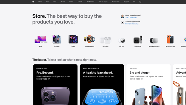
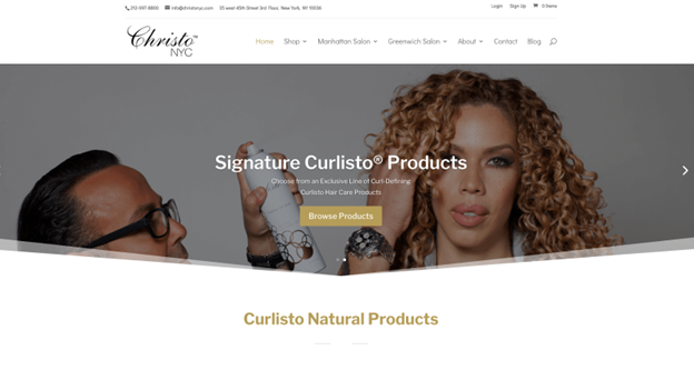
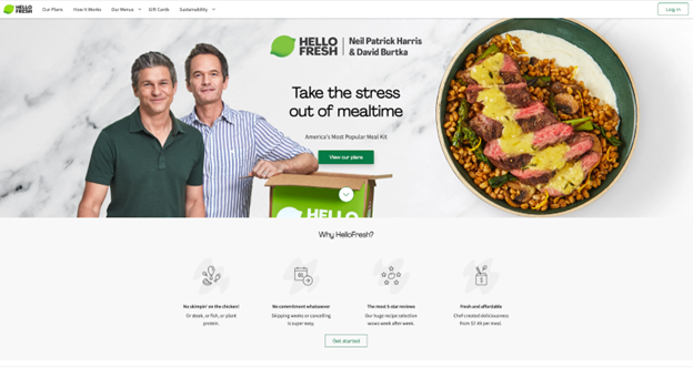
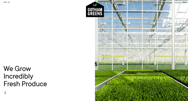
MENU Your website’s design is crucial to your online marketing presence and digital marketing strategy. A well-made website conveys professionalism. By presenting clear, consistent and easy-to-find information, your website can help you earn repeat business and foster customer loyalty. We’ll explore best practices and tools for optimizing your website design process, explain why excellent website design is crucial, and check out examples from impeccably designed business websites. Whether you want to improve your website’s design or you’re just starting to build your website, these eight tips will help you design an appealing, functional website that keeps customers and prospects engaged. When creating or redesigning a website, your first step should be to develop a detailed plan of what you want to do, how to do it, and how each website element will help serve your customers. To get started, you’ll need to pinpoint your target audience and map out a customer journey from start to finish. Customer data informs each design step and determines what your website should offer. For this step, you should gather solid data on the following: Classify your prospects to build customer personas with distinct demographics, pain points, unmet needs and channels they turn to for information. Modern website design is clear, crisp and efficient, so rid your website of anything clunky and unnecessary. Consider removing the following features: Today’s busy customers have short attention spans and don’t want to wade through pages of fluff content to find what they need. Meet customer needs with a straightforward website design that helps them quickly solve their problems. Your online presence should be a cohesive unit, with your website as the hub. Consider including buttons on your website that link to your social platforms, including Facebook, Twitter, LinkedIn and Instagram. Ideally, place them in a footer that travels with the customer as they click from page to page. Include social proof like positive customer reviews, testimonials, awards and endorsements on your home page, product pages and checkout page. More people than ever are visiting websites via tablets and mobile devices, so a scrollable homepage means your website is accessible to more users. Additionally, a scrollable homepage is modern and engaging because you can animate website elements to pop up or move as the user scrolls to them. This design adds an element of interest without being overpowering or distracting. Organize your scrollable homepage into sections to make it easy to navigate. It should include the following sections: White space is no longer something to avoid. Use white space (or blank space of any color) thoughtfully to help break up pages and make your content easier to read by prioritizing essential text. White space can also help you determine where to place other page elements. According to Statista, mobile comprises nearly half of all worldwide web traffic. Additionally, Google data says 50% of mobile users will choose to visit a business’s mobile site over downloading an app, and 59% prioritize the ability to shop via smartphone when choosing a brand to purchase from. It’s clear that businesses must make their websites mobile-friendly. Ensure your website is mobile-responsive and looks just as good on smaller screens as it does on desktops. Tailor your mobile sites to respond directly to visitors’ needs. Consider why they’re accessing your mobile site and what they’re likely looking for, and make it as easy as possible for them to get that information. SEO is vital for any business’s online presence and should be considered at every step of creating or redesigning your website. Consider what content is relevant and interesting to your customers, and build your SEO strategy to cater to that content. Technical SEO tips that can improve page rankings include using a reliable web host, speeding up page load times, and eliminating crawl errors on your site. Customers are highly concerned about and protective of their personal information. Do everything you can to give them the peace of mind of knowing their data is safe on your site. Website security measures include having a current SSL certificate. This small data file binds a cryptographic key to your business and secures credit card transactions, data transfers, logins and browsing. A current SSL certificate is essential because it creates the HTTPS application protocol and the padlock symbol in a user’s search bar. If your website doesn’t have an HTTPS application protocol, Google will often flag your website as not secure and direct the customer away. A good business website incorporates various elements that make the user experience seamless. Some crucial elements to prioritize in your website design include: Most users come to your website with a goal, such as finding an item’s price or contacting customer support. You want to make it as quick and easy as possible for them to complete that goal. A confusing website where users must click around and search extensively creates frustrated customers likely to leave your site for a competitor’s. Your navigation should be clear and self-explanatory and include broad headings with related subtopics. If you have many pages, consider using breadcrumb navigation along with menu navigation so users can easily backtrack to a higher level. Responsive web design focuses on making websites look good and function well on any device. More users are accessing web pages via smartphones and tablets, so a responsive website that works well on various devices is crucial. A mobile-optimized website creates a positive viewing experience by resizing pages, adjusting menu formats and incorporating dropdown tabs. Search engines also consider mobile website layouts when crawling sites, so if you want to appear higher in search engine results, ensure your website is mobile-friendly. To transform your static site into a responsive website, choose a framework that allows you to modify and upgrade your existing site’s code; you’ll then convert the code and review your site. Whether you’re creating a new brand image or reinforcing an existing one, consistency creates a sense of cohesion and professionalism. Your website should have the same layout, typography and color scheme on every page. This way, users know where they are and where the information they need is located on each page. A designated style guide will also make the process of adding pages or elements to your website quick and easy because you have a set template of how those pages should look on the website. It can be easy to go overboard adding images and videos to web pages; after all, images and videos see more engagement than text alone. However, you should avoid overwhelming your pages with too many unnecessary images. Try to achieve a balance of text and appealing images that fulfill a purpose; don’t include an image just for the sake of doing so. Place images after text blocks to support the information. If you’re exploring video content marketing, place explainer videos, how-to videos and video testimonials where they can shed light on specific information. Your images and videos should reiterate your points and engage customers without overwhelming them. Your website copy is crucial because it conveys necessary information to customers. Ensure your copy is well-written and error-free, and that it shares your message in an engaging manner. Your style guide should include guidelines on how to ensure your copy is consistent across your website and all branding materials. Your copy should speak to visitors in terms they’ll understand; avoid being too technical or using too much jargon. Foster a unique brand voice that stays consistent across all your marketing channels and materials. Ideally, customers should be able to know immediately that any piece of content is from your company. A call to action (CTA) directs customers to complete a specific action. For example, you may want them to subscribe to your blog or newsletter as a way to generate more sales leads. Your CTA buttons should be clear and eye-catching and conform to your branding. Sprinkle CTAs throughout your site to continually prompt visitors to take the desired action. Page load speed is how quickly your website pages load when a customer clicks them. Page load speed affects customer behavior directly: If a page takes too long to load, the customer will grow impatient and seek the information on another, faster website. Page load speed also affects how Google ranks your website. You can use Google’s PageSpeed Insights tool to see how quickly your site loads and identify where you can improve your page speed. Fast page load speeds keep customers on your site longer. Other ways to keep customers on your site and boost sales include using pop-up opt-ins to gather information and offering live chat support options. Website design is a critical aspect of successful business marketing. It’s often where you make your first impression on customers and typically where they’ll go to learn about your business. “A website works best when it serves both the business and the visitor,” said Adriane Galea, founder of The Marketing Alchemist. “For the business, it should have clear calls to action and help convert traffic into customers, leads, clients and so on. For the visitor, it should provide an easy solution to their problem or query.” Here are six reasons why website design is crucial: Common website design mistakes include launching an incomplete site, using poor-quality photos, and not checking that all links work. We consulted with experts to pinpoint business websites with excellent designs. Check out these business website designs to help inspire your strategy: Apple has mastered clean, clear minimalist design, and the company’s products and website embody that aesthetic. “I love Apple’s web design and how they get right to the point with a seamless experience for the end user,” said Teo Vanyo, CEO of StealthAgents. The website is visually engaging and easy to navigate, and it carries a cohesive style throughout every page. Plenty of blank space makes the visuals and copy pop and draws your eye to what’s important on each page. Source: Apple Christo NYC is a New York City-based hair salon with a modern, sleek website that showcases the business and makes it easy to book appointments and learn about services. Christo NYC incorporates appealing images without overwhelming the page and has a clear brand style. “I like Christo’s website because it immediately leads people to booking, has a good flow of information, establishes credibility with great website copy, and uses a simple and easy design,” Galea said. Source: Curlisto HelloFresh is a popular meal kit delivery business. The company’s website uses bright colors, punchy copy and a scrollable design. The homepage is engaging, with clear sections and multiple calls to action. “If you visit their website, you will notice that everything is available from the homepage,” said Ryan Scribner, co-owner of personal finance blog Investing Simple. “You can learn about the product, sign up for a subscription plan, and even read the FAQ right from the homepage. Most people who visit the site will have their questions answered right on the homepage, meaning they don’t have to go digging for information. From a design standpoint, this site is great, too. You find consistent branding, colors and fonts site-wide.” Source: HelloFresh Gotham Greens is a greens grower and distributor based in New York City. The company’s website uses a modern, minimalist aesthetic with a scrollable homepage. The website’s copy is minimal and direct, making it easy for customers to learn what the business does and find what they need. “It’s simple but effective, utilizing a one-page design to present the most relevant information without the user having to do more than scroll,” said Jake Hill, CEO of DebtHammer. Source: Gotham Greens If you’re considering outside help, ask your web developer some essential questions. For example, have they worked on projects like yours? What services do they provide? What do they charge? The best website builders and design services can help you create the perfect website. We’ll highlight a few that business owners and marketers recommend. Wix offers free, customizable website templates for creating your website pages. “There are many free resources out there that offer templates that are completely customizable, but one of my favorites is Wix,” said Kelly Andersen, marketing director at Wealth Continuum Group. “They have beautiful designs, and it is simple to create a completely customized website that is also optimized for mobile, and that will also be able to be found on Google and other search engines.” Learn more about how Wix can solve your web design needs. Figma and Sketch are two web-based vector graphics editors and prototyping tools that allow users to design, prototype and collect customer feedback. They both offer collaboration features like real-time feedback and easy file sharing, allowing team members to work together seamlessly. “We recommend Figma and Sketch,” said Paula Glynn, director of search marketing and digital strategy at Pixelstorm. “These tools integrate really well into the web development process, and using these [tools] results in pixel-perfect websites. They are both run by innovative companies who keep the tools and improvements updated regularly.” Canva is a graphic design platform you can use to create multiple types of visual content, including website graphics. Canva is free, but paid subscriptions offer increased functionality. “Canva is, hands down, the best resource for easily creating professional-looking graphics, logos, and more, and can also be a huge help in creating content for social media,” Galea said. Elementor is a software company that allows users of the website builder WordPress to create and edit their websites using a drag-and-drop builder tool. The software features a built-in responsive mode and can help you speed up your website, drive traffic, and create professional-looking web pages. “I love Elementor. It’s a drag-and-drop website design tool, and you don’t need to have any website design experience to use it,” said Julian Goldie, who runs an SEO link-building business. “What would normally take you hours to code (or a lot of money in website design staff) can easily be achieved in minutes with Elementor.” Hotjar is a behavior analytics tool that analyzes website use and provides feedback in the form of heat maps, session recordings and surveys to help you determine which parts of your website are performing well and which require attention. “A heat map, like Hotjar or Crazy Egg, allows a webmaster to install a snippet of code on their site,” said Ben McLaughlan, founder and owner of Easy Mode Media. “The app then records valuable information about audience interaction with the website. If there is a section of the page that people click away from or a button that never gets clicked, this is important information when optimizing a website and landing page for conversions.” Kiely Kuligowski contributed to the reporting and writing in this article. Some source interviews were conducted for a previous version of this article. B. newsletter is your digest of bite-sized news, thought & brand leadership, and entertainment. All in one email. Our mission is to help you take your team, your business and your career to the next level. Whether you're here for product recommendations, research or career advice, we're happy you're here!
Utilizamos cookies no nosso website para lhe proporcionar a melhor experiência possível, lembrando as suas preferências e visitas repetidas. Ao clicar em “Aceitar”, está a consentir o uso de todos os cookies. Em alternativa, pode visitar “Definições de Cookies” para personalizar o seu consentimento.
Este website utiliza cookies para melhorar a sua experiência de navegação. Dentre estes cookies, os cookies classificados como necessários são armazenados no seu navegador, pois são essenciais para o funcionamento das funcionalidades básicas do website. Também utilizamos cookies de terceiros que nos ajudam a analisar e compreender como utiliza o website. Estes cookies serão armazenados no seu navegador apenas com o seu consentimento. Tem também a opção de desativar estes cookies, embora isso possa afetar a sua experiência de navegação.
Os cookies necessários são absolutamente essenciais para que o site funcione corretamente. Esses cookies garantem funcionalidades básicas e recursos de segurança do site, anonimamente.
Os cookies funcionais ajudam a executar certas funcionalidades, como compartilhar o conteúdo do site em plataformas de mídia social, coletar feedbacks e outros recursos de terceiros.
Os cookies de desempenho são usados para entender e analisar os principais índices de desempenho do site, o que ajuda a fornecer uma melhor experiência do usuário para os visitantes.
Cookies analíticos são usados para entender como os visitantes interagem com o site. Esses cookies ajudam a fornecer informações sobre métricas, número de visitantes, taxa de rejeição, fonte de tráfego, etc.
Os cookies de publicidade são usados para fornecer aos visitantes anúncios e campanhas de marketing relevantes. Esses cookies rastreiam visitantes em sites e coletam informações para fornecer anúncios personalizados.